Davenport "Montreal" Platter - c 1835 |
 |
| Platter - "Montreal Pattern" by Davenport, c 1835 |
| Orig. earthenware platter - Size - 38 x 45.5 cm Found - Toronto, ON Signed Montreal |
Transfer Ware
Before the 19th century, images on earthenware had often been painted on by hand. Others - like those on the wildly popular blue Willow pattern had been put on with paper transfers.
Then, around 1800, British potters picked up, with a vengeance, a process that had been known before, but sparingly used, namely, transferring by printing wet ink images via paper on to earthenware, before the glaze was applied. The process was multi-phase and used a progression of workers.
Etch - The original images, probably done in watercolour, were etched into a copper plate.
Ink - Colours, a mix of inks and linseed oil, were then applied, on top of the copper plate, it then being temporarily placed in a stove to make the colours more fluid.
Imprint & Press - A dampened tissue paper was carefully placed on top of the coloured image, and together with the copper plate, passed through a press to transfer the image from plate to paper.
Trim - A second woman trimmed the excess ink spots and paper from around the borders of the desired image.
Apply - A third woman took the cropped image, wet with ink, and pressed it lightly and carefully on to the unglazed pottery surface, whether plate, pitcher, or vegetable dish.
Press - Then, another woman, using a tightly rolled piece of woollen cloth, would press the transfer, tightly, into every nook and cranny of the piece. In the case of the platter, right, there were a lot of crannies because of the furrows to let the gravy flow away.
Dry - The piece would then be let stand for an hour to let the coloured inks from the image be absorbed by the bisque.
Soak & Peel - The piece would then be immersed in water, to soften up the paper, so it could be peeled off more easily, leaving the earthenware sporting its new image.
Dry - The piece was then left to stand till dry, and then placed in an oven to warm it gently to let the oil, mixed in with the original inks, dissipate.
Glaze & Fire - The glaze is then applied, the piece fired, resulting in transfer ware. The platter right, being known as blue transfer ware.
The term blue transfer ware was, for a long time, used generically for all colour printed wares, because at first only blue inks could be successfully used. The term remained in general usage even later, when other inks, like brown, pink, lavender, and grey were used instead.
Transfer ware - ink images printed under the glaze by British potters - took the market by storm, and became the most popular type of chinaware in the world during the 19th century.
All the pieces on this page were decorated in this fashion, though today we differentiate between brown and blue, etc., transfer ware.
 This huge and spectacular platter, featuring the British America, a noted steamship from the time, is from a dinner service introduced by the English Staffordshire firm of Davenport (1794-1887) in the mid 1830s.
Steamship transportation on the St. Lawrence River dates from 1809, when the Montreal brewer, John Molson, launched the Accommodation and began the St. Lawrence Steamboat Company. She, and subsequent steamers he built, acted as tow boats and passenger ships. They transported so many immigrants along the waterway to Ontario that, in 1820, a paper in Kingston warned, "They set this way in such o'erwhelming floods, Canadians! take your last look at the woods!"
 The British America, built in 1829 for the Torrance family, was much more powerful than the early steamships; in fact Bourne, tellingly, shows her battling upstream against the treacherous St. Mary's current which earlier ships could not do.
Like on most Canadian historical chinaware from the 19th century, the scene was copied from a real image of the time, which in this case, was drastically changed.
Elizabeth Collard believed this view was originally copied from an image of Montreal from St. Helen's Island, painted, in 1830, by Robert Sproule, and published as an engraving by Adolphus Bourne, who was also an importer of earthenware and porcelain.
But so much is altered - all the ships and foreground have been changed beyond comparison - that the transfer is more accurately the result of a lot of collage work, borrowing from other prints, as well as the imagination, to represent the scene one might see from a spot which remained a popular viewpoint all during the 19th century. (The rollover gives you another version of the engraving.)
Below is an old watercolour of the same scene, signed and dated 1830, but obviously owing a lot to the 1830 engraving.
|

Dark blue printing had been all the rage for dinner services in the 1820s, like in the ubiquitous Willow pattern pieces.
Then, in the 1830s, china in pale blue - like this platter - became popular, as well as grey, pink, lavender, black, and brown.
This platter, commonly known as a "well and tree" type, because it has a gravy "well" on the right side, a dip in the platter, to allow the drippings to drain away from the meat, along the shallow furrows - like branches of a "tree" emanating from the "well" - in the bottom of the plate. This well necessitated a big bulge under the platter, overcome by raising the plate slightly, on large ridges.

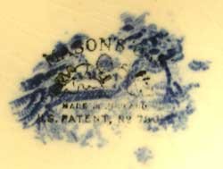
The mark for the Davenport "Montreal" pattern on the back.
One can only dream of how many sparkling conversations it has eavesdropped on during over 170 years of service.
Below, sold 2002, at auction, from the Elizabeth Collard Estate for $3000 including premium.


 Francis T Thomas of Quebec started a china importing business in 1874.
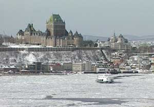 It can also be considered the location of the birthplace of Canada - the exact spot where permanent settlement by French colonists took place with the establishment of Champlain's Habitation, in 1608, where the church Notre Dame des Victoires is located on the extreme right of the picture above. Louis Hébert's historic farm - Louis is considered Canada's first, make that cash crop, farmer - was located to the left of the steepled building at the far top left. In time the Chateaux of the French Governors of Canada were built just to the left of the far end of the promenade, complete with the Governor's Garden, in which you can still follow in the footsteps where Frontenac once walked in the 1600s (the woods to the left of the hotel left). The site was razed, in the 1890s, to put up the Chateau Frontenac, Canada's most famous hotel, on Canada's most historic site, offering the finest hotel view of any in Canada.
 So there it is, in a state of full arousal, looking most unsatisfied, gracing his table service for the ages. And giving most Canadian beavers an undeservedly bad rap as uncooperative...


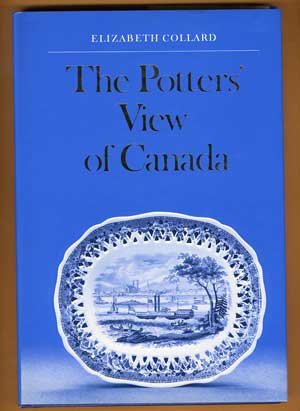
 No one has done more, to sleuth out the background to Canada's potted past, than has Elizabeth Collard (1917-2001).
 Her books are widely available and give all Canadians a highly readable, down to earth account of Canadian antique (Victorian and Edwardian) pottery, that, in the hands of lesser mortals, often sounds pedantic and boring.